UAIC 2
UAIC 2
A UX redesign of UAIC’s agent portal simplifying a complex application flow.
A UX redesign of UAIC’s agent portal simplifying a complex application flow.

Overview
Overview
United Automobile Insurance Company (UAIC) is a Florida-based insurance carrier operating across multiple US states. The "Become an Agent" portal is the primary digital touchpoint for prospective insurance agents applying to join UAIC's network covering everything from initial prospect registration to multi-step application submission, document upload, and confirmation. The redesign scope focused on the Florida flow, which serves as the pilot before rollout across other states (TX and beyond). The existing portal had accumulated UX debt inconsistent layouts, unclear step progression, and a login/registration experience that didn't clearly guide first-time applicants. The goal was to redesign the complete flow into a coherent, branded product experience that felt trustworthy and operationally efficient.
United Automobile Insurance Company (UAIC) is a Florida-based insurance carrier operating across multiple US states. The "Become an Agent" portal is the primary digital touchpoint for prospective insurance agents applying to join UAIC's network covering everything from initial prospect registration to multi-step application submission, document upload, and confirmation. The redesign scope focused on the Florida flow, which serves as the pilot before rollout across other states (TX and beyond). The existing portal had accumulated UX debt inconsistent layouts, unclear step progression, and a login/registration experience that didn't clearly guide first-time applicants. The goal was to redesign the complete flow into a coherent, branded product experience that felt trustworthy and operationally efficient.
Services
Web Design · UX Redesign · Product Design
Stack
Figma · Adobe CC
Industry
B2C · InsurTech · Insurance
Challenge
Challenge
The existing portal reflected years of incremental changes rather than intentional design. The registration and login screens lacked visual hierarchy, making it unclear whether a returning or new user should proceed differently. The multi-step application had no persistent progress indicator, leaving applicants without a clear sense of how far they were or how much remained. Form pages were dense and inconsistently structured, some steps felt significantly heavier than others with no visual balancing. The overall experience didn't reflect the credibility of an established insurance carrier, creating trust friction at a high-stakes conversion point.
The existing portal reflected years of incremental changes rather than intentional design. The registration and login screens lacked visual hierarchy, making it unclear whether a returning or new user should proceed differently. The multi-step application had no persistent progress indicator, leaving applicants without a clear sense of how far they were or how much remained. Form pages were dense and inconsistently structured, some steps felt significantly heavier than others with no visual balancing. The overall experience didn't reflect the credibility of an established insurance carrier, creating trust friction at a high-stakes conversion point.
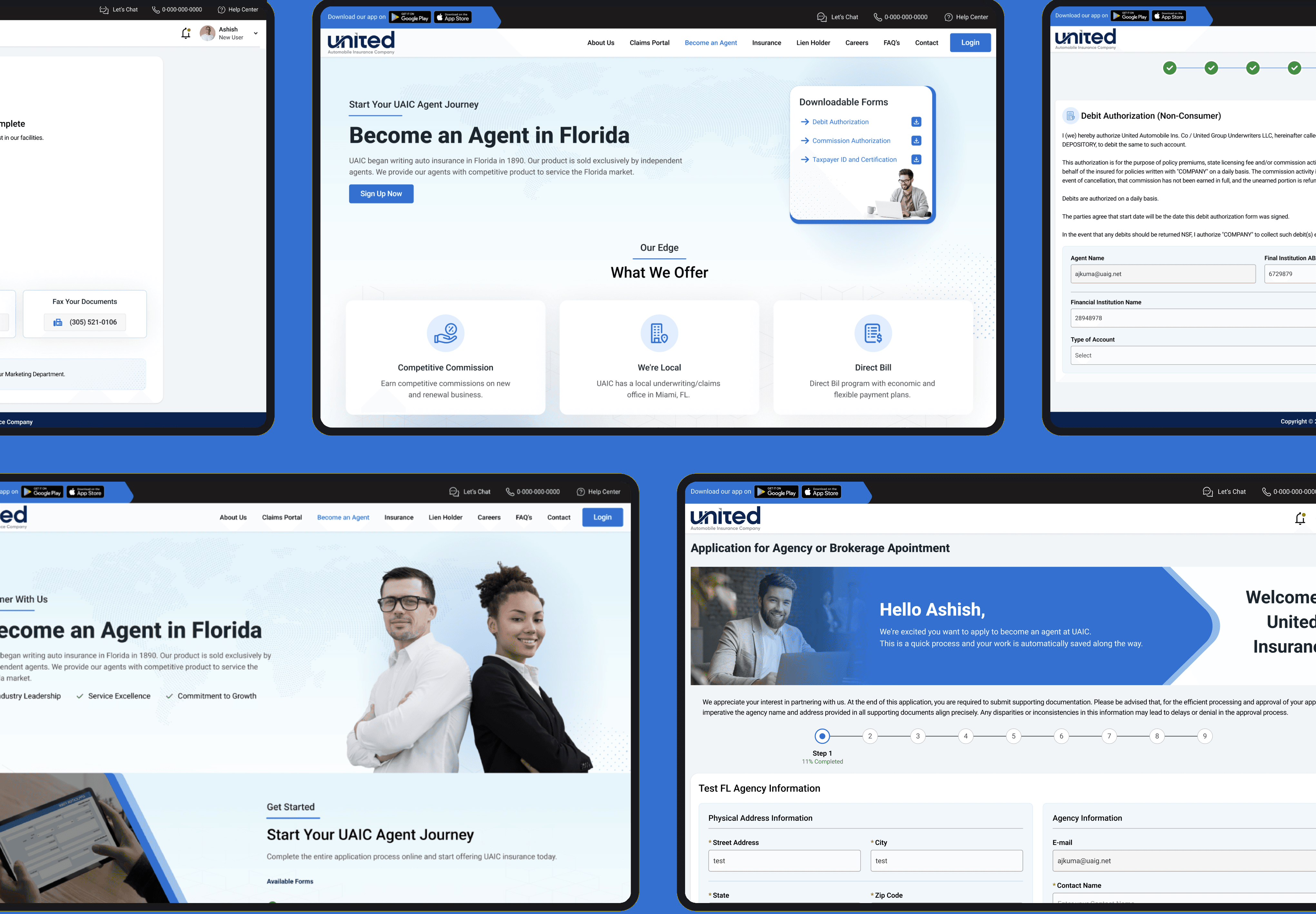
Persistent step progress across all form stages
Persistent step progress across all form stages
Every application step shares the same bottom navigation and progress component, giving applicants constant visibility into where they are and what remains, improving perceived control over the process.
Every application step shares the same bottom navigation and progress component, giving applicants constant visibility into where they are and what remains, improving perceived control over the process.
Saved application resume flow
Saved application resume flow
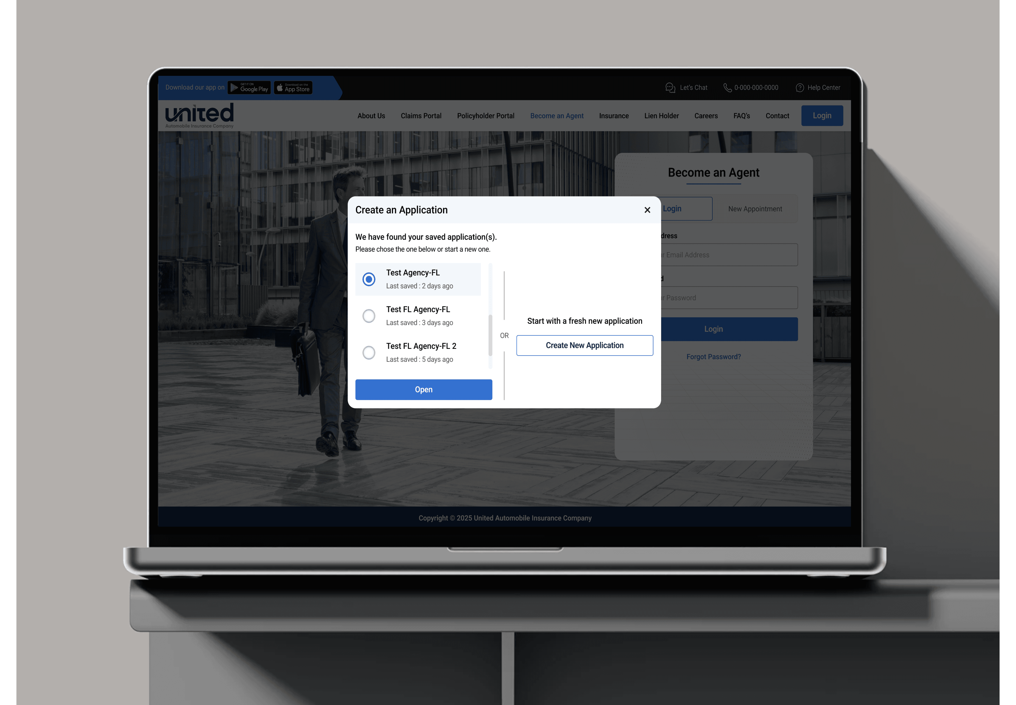
Returning users are shown their in-progress records in a structured recall modal, reducing re-entry friction and improving completion rates for applicants who couldn't finish in a single session.
Returning users are shown their in-progress records in a structured recall modal, reducing re-entry friction and improving completion rates for applicants who couldn't finish in a single session.
Isolated file upload step
Isolated file upload step
Document submission is treated as its own dedicated step: clean, focused, and free of competing form fields, making compliance requirements feel approachable rather than burdensome.
Document submission is treated as its own dedicated step: clean, focused, and free of competing form fields, making compliance requirements feel approachable rather than burdensome.
