[OVERVIEW]
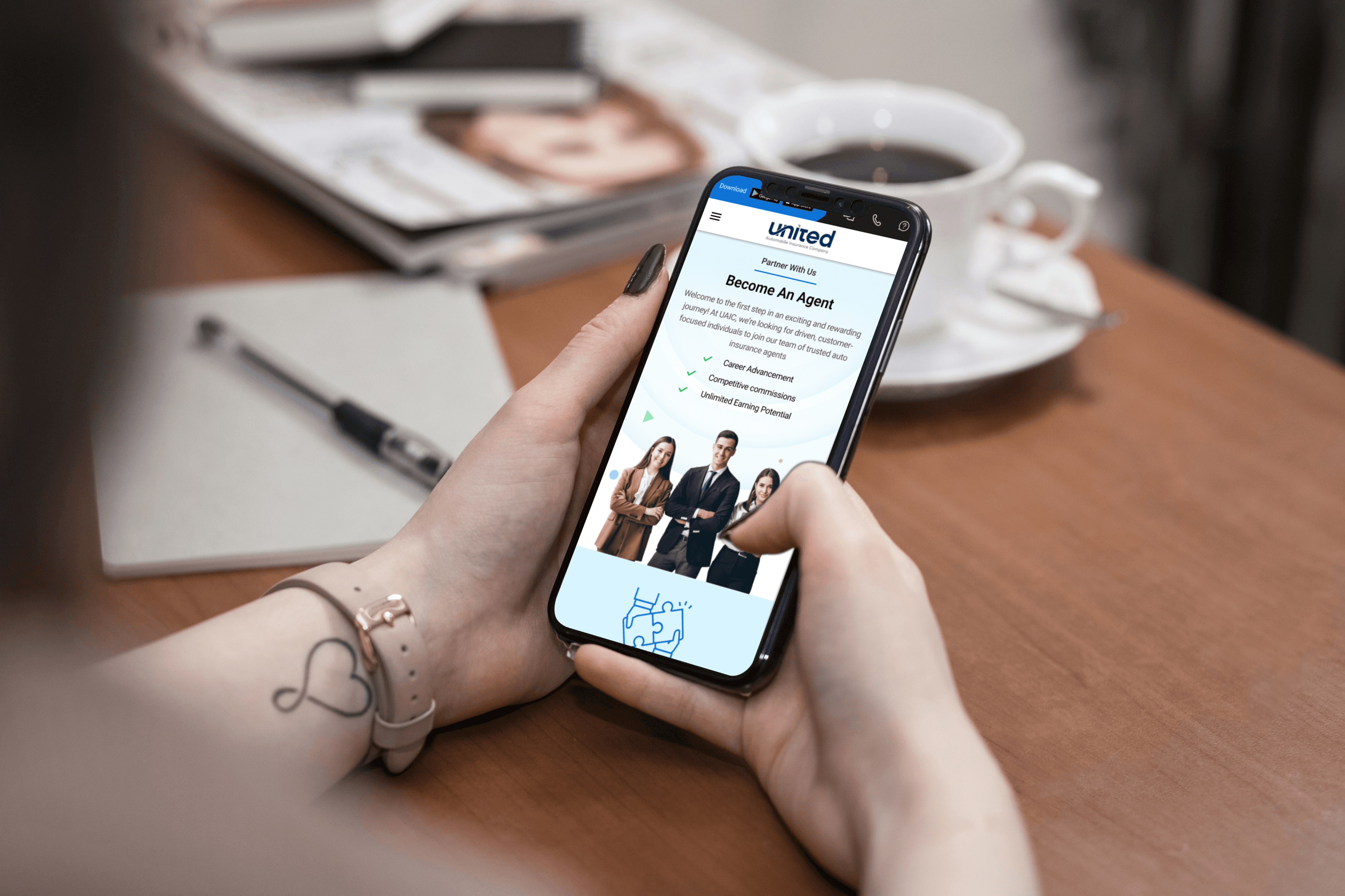
Designed a mobile-responsive version of the United Automobile Insurance Company (UAIC) platform, transforming the existing desktop interface into an intuitive, accessible, and efficient experience on smaller screens. The design focuses on usability, seamless interactions, and clear information hierarchy, enabling users to easily access key services such as policy quotations, agent searches, and claim status from their mobile devices.
Platform
Mobile Responsive design
Category
Automobile Insurance Company
Location
Texas, USA
Client
UAIC
Year
2025
[ PROBLEM ]
The desktop design for the UAIC platform was already in place, but there was no interactive and responsive design solution for smaller devices. The challenge was to ensure a consistent user experience across devices, maintain usability standards, and design touch-friendly interactions while preserving the brand’s visual language. The solution needed to simplify complex flows like login, agent search, and claim portals for mobile without overwhelming the user.
[BEHIND THE SHOT]
I designed a fully responsive mobile version of the UAIC platform, focusing on:
Usability and Accessibility: Ensured large touch targets, readable typography, and easy navigation for one-handed use.
Consistent Visual System: Maintained the brand’s color scheme, iconography, and visual hierarchy from the desktop version to foster brand consistency.
Efficient Information Architecture: Streamlined the navigation using a hamburger menu to provide easy access to key sections like About Us, Claims Portal, Careers, and Contact.
Mobile-First Interactions: Applied UX best practices, like progressive disclosure and clear CTAs, ensuring a seamless and intuitive experience on small screens.
This resulted in a user-centric, responsive design that enhances the digital insurance service experience on mobile, increasing engagement and reducing drop-offs in critical user flows.


